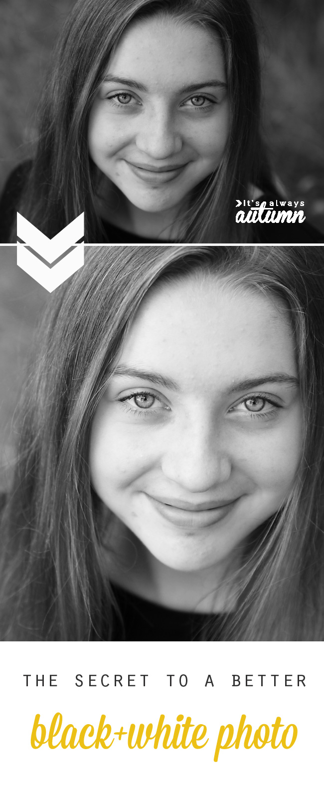
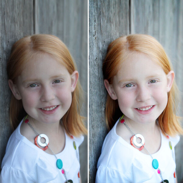
 Have you ever converted one of your favorite photos to black and white and been disappointed with the result? Take a look at the photos below:
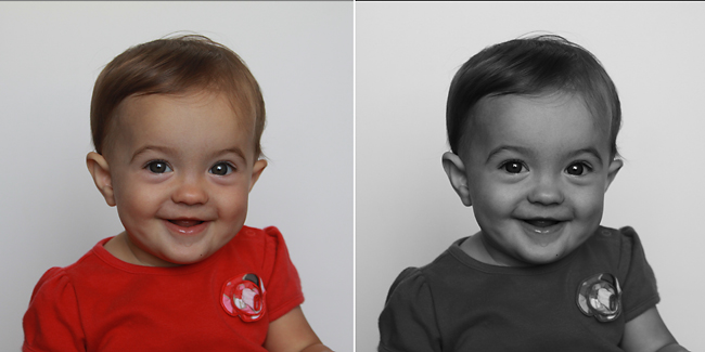
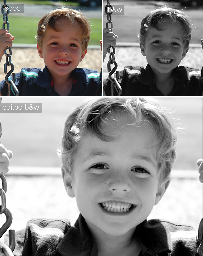
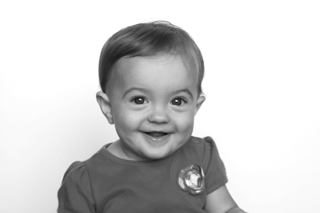
This was one of my favorite photos from an early photoshoot of my daughter. The colors were bright, it’s well exposed, and her expression is adorable. However, when I converted it to b&w it ended up looking “muddy” – kind of dark and gray and not nearly as pretty as the b&w photos you see posted online. And the bad news is that once I get this printed out, it will look even worse, since printed photos often appear darker than what you see on your monitor. The good news is there’s an easy fix for this problem, and I’m sharing it with you today. Keep reading for more photos and screenshots showing you how to edit your black and whites.
Most portraits taken on auto require a bit of brightening (due to how the camera decides to expose the photo), and black and white photos require even more brightening + added contrast to really look good. A photo that looks fine in color will often look dark when converted to black and white, but in a few easy steps (in just about any photo processing program) you can take your black and white photo from blah to beautiful – and the difference will look even more dramatic once the photos are printed out.
NOTE: If the “edited b&w” photos in this post look too bright or washed out, turn down the brightness on your monitor. If your monitor brightness is turned all the way up (which it probably is) the photos will display on your screen MUCH BRIGHTER than they would print out – which will leave you with dark prints. You should always have your monitor brightness at only 1/3-1/2 of the way up when editing photos.
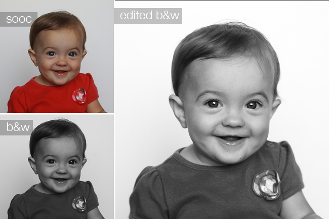
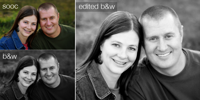
Before I show you how easy it is to get a better b&w, I want to show a few more examples of what a difference brightening and adding contrast can make, especially for a b&w. The color version of the photo below looks just fine, but the b&w is obviously much too dark. Look how much better the edited version is:
(Note: if you get photos where people’s skin looks kind of red, chances are your photo needs brightening not color correction!)
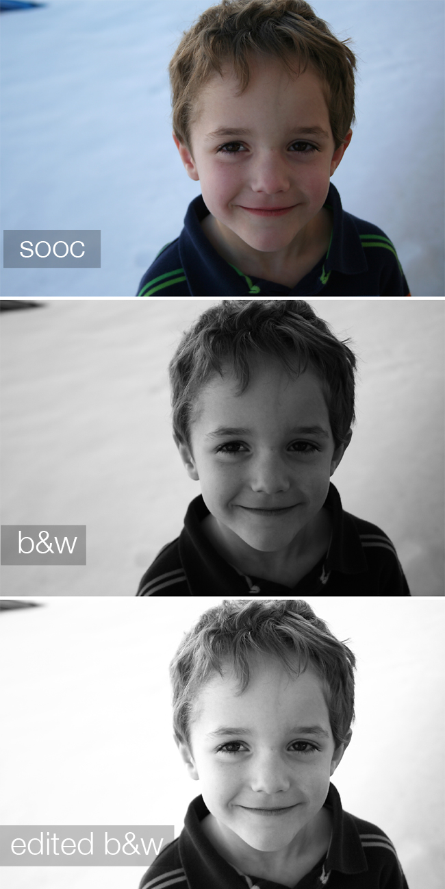
In this next photo you can tell brightening is necessary – the snow should look white, not blue or gray!
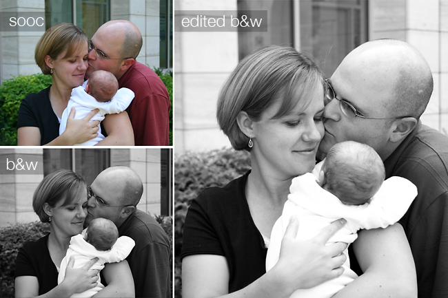
This photo is of me and my husband and our fourth child – it’s very sweet and I love it, but the normal b&w version is so dark it looses a lot of it’s appeal.
Convinced yet? Ready to add brightness and contrast? It’s super easy. You just need to locate the histogram on whatever photo processing program you are using. In Photoshop and Elements it’s in the levels menu (ctrl-L) and in iPhoto it’s under edit>adjust. If you don’t have either of these applications, go online to Picmonkey.com. You’ll be able to make these same changes from the exposure controls, but you don’t use the histogram – it’s even easier to do there.)
The histogram looks like a mountain range, and represents the data in your photo. The left side of the range represents the darks, the middle represent midtones (grays in a b&w) and the right side represent highlights, or bright portions. There are three triangles under the histogram you can move around to change how your photo looks:
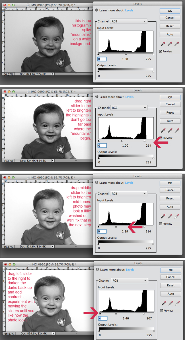
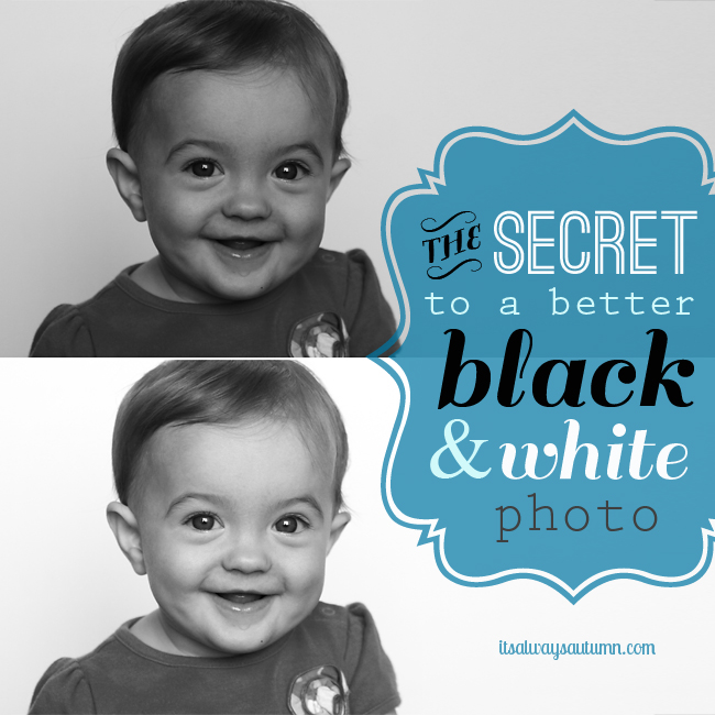
Essentially, you add brightness by moving the right and middle slider toward the left, then you add contrast (darkening the dark portions) by moving the left slider toward the right. Play around for a minute or two, and suddenly your black and white photo is much more dramatic:
It’s an extremely quick and easy edit, but it makes a huge difference.
Never miss a post: f a c e b o o k | p i n t e r e s t | t w i t t e r | e m a i l s u b s c r i p t i o n
LINKING Tip Junkie | Sugar Bee Crafts | Today’s Creative Blog | SNAP | Somewhat Simple | The 36th Avenue | Whipperberry | Naptime Crafters | Tatertots and Jello | Little Inspiration | I Heart Naptime

Photography Laptops says
Hi autumn,
Your photos are looking beautiful! My B&W never turn out too well, I am going to give your method a try.
Lexi says
OMG! Thank you for including the tip of the monitor brightness! I never would have thought of that and I’ve never seen anyone say that before! Duh! It seems so obvious now!
Pam says
Your photos look great! My B&W never turn out too well, I am going to give your method a try.
autumn says
thanks, Pam!
KT says
MANY thanks for your awesome BW tutorial! I have PS for editing my photos, but I feel like I’m using only 1% of what it’s capable of doing….now with your terrific instructions, I’m up to 1.5%!
autumn says
Ha ha! I know exactly what you mean about PS – there’s quite a learning curve!